**It may seem strange, that a scientist is saying that you should learn how to make fake data — but it's a really useful skill!** If you ever need to test an idea, or you're curious how a function works, or you want to make sure a function is doing what it should, or checking how something is plotted, or a myriad of other reasons, knowing how to whip up some fake data to use in your testing is super valuable.
Very frequently in my code you may see examples of using fake data to help with various tasks. Below are some examples that you can check out:
- [plotting-playground](https://github.com/aibhleog/plotting-playground/tree/master) — a repository housing various plotting codes // some using fake data for the visualization
- [optimized-extraction](https://github.com/aibhleog/tutorial-optimized-extraction) — a brief tutorial on how to play with spectroscopy using code, including how to optimially-extract a spectrum // the example spectrum is fake
- [patches-pixels](https://github.com/aibhleog/patches-pixels) — code to play around with mapping matplotlib shapes to pixel coordinates // the example 2D image is fake
- [patches-pixels-refined](https://github.com/aibhleog/patches-pixels-refined) — an extension off the previous repository, with partial pixel coverage calculated // the example 2D image is fake
- [exoplants-WSP](http://github.com/aibhleog/exoplanets-wsp) — introductory code teaching research concepts for a 1-week summer program // the initial exoplanet transit tracking data is fake
In this notebook, I'll walk through a few examples of when whipping up some fake data quickly can be really useful. But first, let's start with the basics.
----------
# The Basics of Making Data
Fake data can be as simple or complex as you need it. If you're just testing a quick thing, then starting simple could be all you need. If you're testing something a bit more involved, then perhaps you'll need to add some complexity in there. I'll show you examples across this regime.
```python
# importing packages we'll need
import numpy as np # math package
import matplotlib.pyplot as plt # plotting/visualization package
import matplotlib.gridspec as gridspec # plotting with subpanels
```
## Making Fake 1D Data
Let's start with making a fake 1D array, which we'll be pretending is a 1D spectrum from a telescope.
```python
# making a 1D array of 100 values
base_array = np.ones(100) # array shape is 1x100
print(base_array)
```
[1. 1. 1. 1. 1. 1. 1. 1. 1. 1. 1. 1. 1. 1. 1. 1. 1. 1. 1. 1. 1. 1. 1. 1.
1. 1. 1. 1. 1. 1. 1. 1. 1. 1. 1. 1. 1. 1. 1. 1. 1. 1. 1. 1. 1. 1. 1. 1.
1. 1. 1. 1. 1. 1. 1. 1. 1. 1. 1. 1. 1. 1. 1. 1. 1. 1. 1. 1. 1. 1. 1. 1.
1. 1. 1. 1. 1. 1. 1. 1. 1. 1. 1. 1. 1. 1. 1. 1. 1. 1. 1. 1. 1. 1. 1. 1.
1. 1. 1. 1.]
Now, let's add in some randomness, using `numpy.random.rand` ([definition](https://numpy.org/doc/stable/reference/random/generated/numpy.random.rand.html)). This returns random decimal numbers between 0 and 1, matching whatever dimensions we give it.
```python
# first making the random values array, the same size as the base_array
randomness = np.random.rand(100) # array shape is 1x100
randomness -= (np.median(base_array) / 2) # subtracting randomness by half of
# median value in base_array so that the final noisy_array will be centered on base_array
# (i.e., will look like base_array but with noise added)
# adding the randomness array to the base_array
noisy_array = base_array + randomness
```
Because we're pretending the 1D array is a 1D spectrum, we'll plot it as if it were describing flux as a function of wavelength.
```python
plt.figure(figsize=(10,4))
plt.step(range(100),base_array,label='base array')
plt.step(range(100),noisy_array,label='noisy array')
plt.xlabel('fake wavelength')
plt.ylabel('fake flux')
plt.legend()
plt.show()
plt.close('all')
```
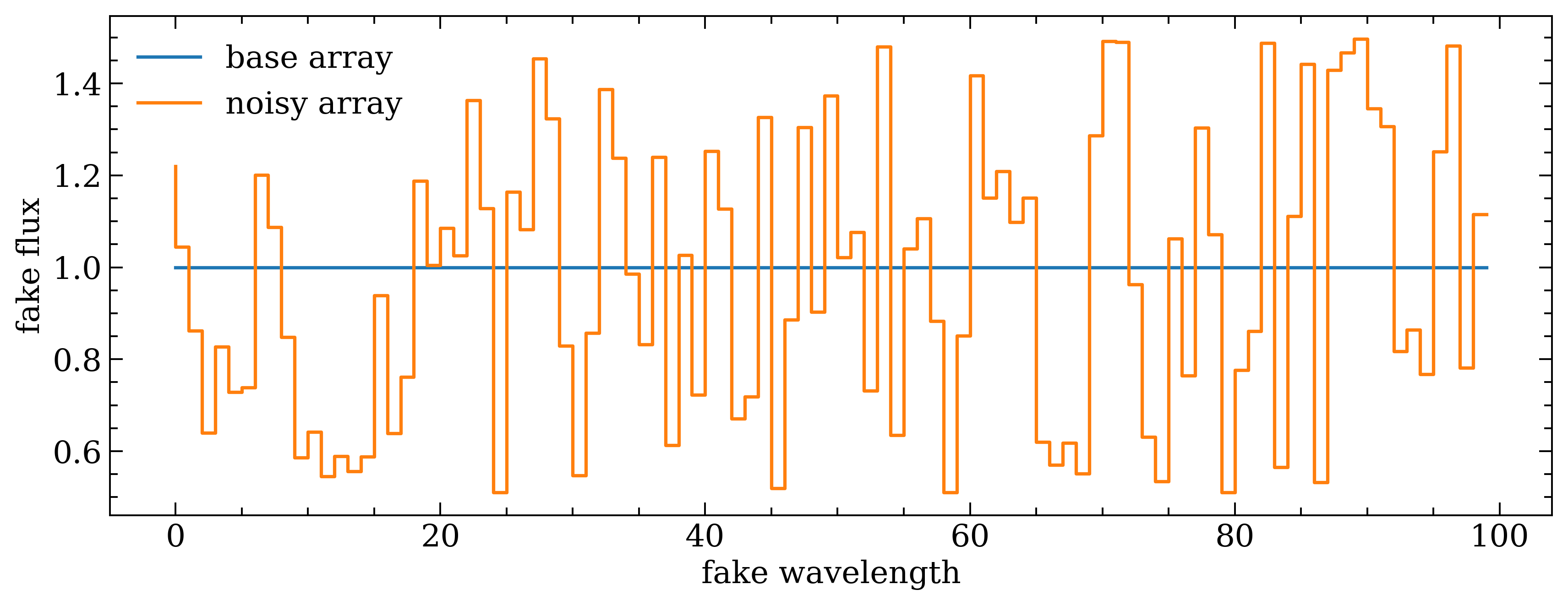
If the noisy_array data were real, that would be some pretty noisy data! Because the original "true" array, base_array, is on order the same magnitude as the extent of the noise. If one were to describe this data in terms of how well-detected or well-constrained it is, it could reliably be called "low S/N data".
So, let's make another version of noisy_array where we scale down the noise by 10%.
```python
# copying the old noisy_array so we can compare it
old_noisy_array = noisy_array.copy()
# re-adding the randomness array to the base_array, but scaling down randomness by 10%
noisy_array = base_array + (randomness*0.1)
# looking at it!
plt.figure(figsize=(10,4))
plt.step(range(100),base_array,label='base array')
plt.step(range(100),noisy_array,label='noisy array')
plt.step(range(100),old_noisy_array,label='old noisy array',zorder=0,alpha=0.5) # putting it in back, a bit transparent
plt.xlabel('fake wavelength')
plt.ylabel('fake flux')
plt.legend(ncol=3)
plt.show()
plt.close('all')
```
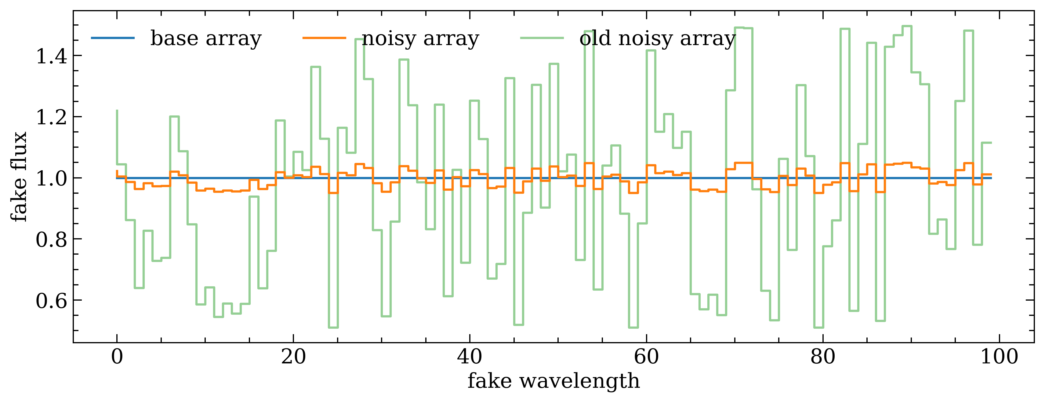
Nice! Being able to adjust the S/N can be helpful, depending upon the task/test/tool for which you need fake data.
### Different ways to visualize 1D data
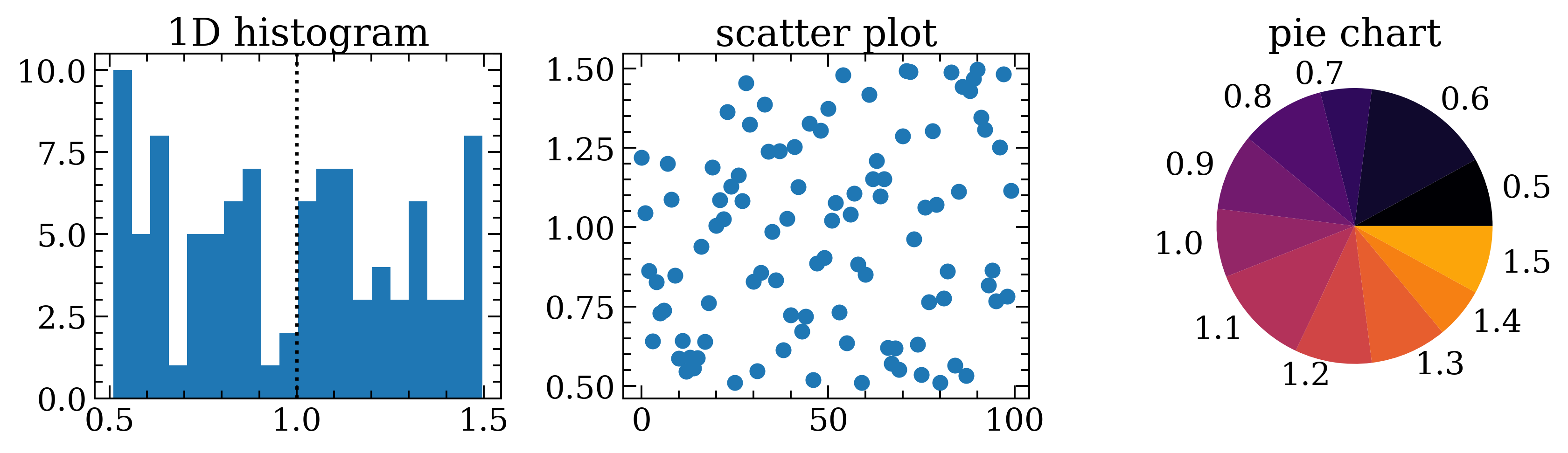
Let's take this 1D data and play with different ways to look at it! The previous example is the most common way I use fake 1D data, where I'm pretending it's a spectrum for some kind of testing. However, for this example, we'll look at a histogram, scatter plot, and pie chart.
```python
# to make it easier to see differences, we're going to replace the new noisy_array with the old one
noisy_array = old_noisy_array.copy()
```
```python
# making a multi-panel figure
# --------------------------
plt.figure(figsize=(10,3))
gs = gridspec.GridSpec(1,3)
# a histogram of all values
ax = plt.subplot(gs[0])
ax.set_title('1D histogram')
__ = ax.hist(noisy_array)
plt.axvline(1,ls=':',color='k') # the "true" value
# scatter plot!
ax = plt.subplot(gs[1])
ax.set_title('scatter plot')
ax.scatter(range(100),noisy_array)
# pie chart view, after rounding numbers to the nearest tenths decimal place
ax = plt.subplot(gs[2])
ax.set_title('pie chart')
rounded_array = [round(f,1) for f in noisy_array] # rounds to the tenths place!
values, counts = np.unique(rounded_array,return_counts=True)
colors = [plt.get_cmap('inferno')(j) for j in np.linspace(0,0.8,len(values))]
ax.pie(counts,labels=values,colors=colors)
plt.show()
plt.close('all')
```
### Adding more "signal" to fake data
Okay, so now that we have an array of values that randomly scatter around the original "true" value (all 1's), let's lean into pretending that this is a 1D spectrum and add an emission line. We'll do this by making a Gaussian shape ([wiki](https://en.wikipedia.org/wiki/Gaussian_function)) in a 1D array, using tools provided by the [astropy](https://www.astropy.org/about.html) group.
```python
from astropy.convolution import Gaussian1DKernel # making fake data
# fun fact! if you ever wanna know or be reminded of the input parameters needed for a function,
# or if you forget all the things that a function can do, you can do this neat trick by adding a ?
# after the function name and running the cell/pressing enter in your iPython terminal!
Gaussian1DKernel?
```
```python
# PRINTED OUTPUT
'''
Init signature: Gaussian1DKernel(stddev, **kwargs)
Docstring:
1D Gaussian filter kernel.
The Gaussian filter is a filter with great smoothing properties. It is
isotropic and does not produce artifacts.
The generated kernel is normalized so that it integrates to 1.
Parameters
----------
stddev : number
Standard deviation of the Gaussian kernel.
x_size : int, optional
Size of the kernel array. Default = ⌊8*stddev+1⌋.
mode : {'center', 'linear_interp', 'oversample', 'integrate'}, optional
One of the following discretization modes:
* 'center' (default)
Discretize model by taking the value
at the center of the bin.
* 'linear_interp'
Discretize model by linearly interpolating
between the values at the corners of the bin.
* 'oversample'
Discretize model by taking the average
on an oversampled grid.
* 'integrate'
Discretize model by integrating the
model over the bin. Very slow.
factor : number, optional
Factor of oversampling. Default factor = 10. If the factor
is too large, evaluation can be very slow.
See Also
--------
Box1DKernel, Trapezoid1DKernel, RickerWavelet1DKernel
Examples
--------
Kernel response:
.. plot::
:include-source:
import matplotlib.pyplot as plt
from astropy.convolution import Gaussian1DKernel
gauss_1D_kernel = Gaussian1DKernel(10)
plt.plot(gauss_1D_kernel, drawstyle='steps')
plt.xlabel('x [pixels]')
plt.ylabel('value')
plt.show()
File: ~/miniforge3/envs/stenv/lib/python3.12/site-packages/astropy/convolution/kernels.py
Type: type
Subclasses:
'''
```
```python
# using Gaussian1DKernel from astropy
gaussian = Gaussian1DKernel(stddev=3.5,x_size=len(noisy_array)).array # spatial profile
```
```python
# let's look at that
plt.figure(figsize=(10,4))
plt.step(range(100),gaussian,label='Gaussian1DKernel array')
plt.xlabel('fake wavelength')
plt.ylabel('fake flux')
plt.legend()
plt.show()
plt.close('all')
```
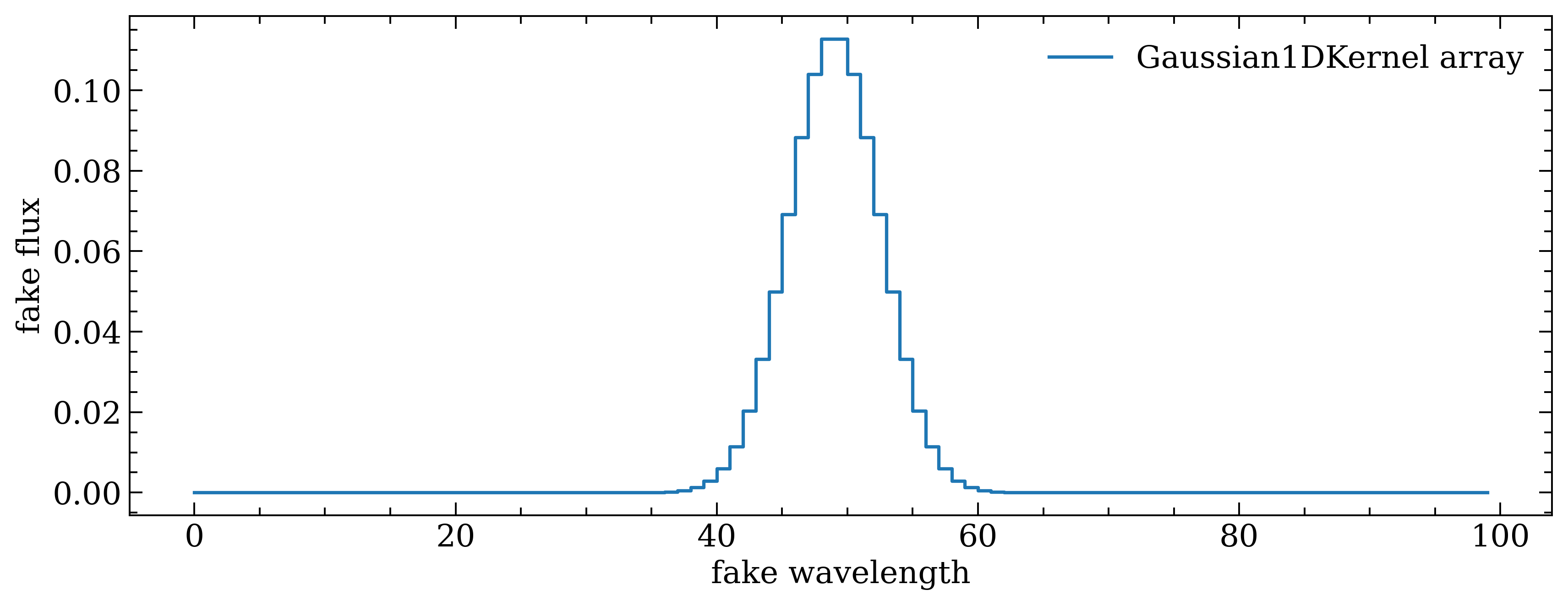
Now, let's compare to the noisy array to see how much we need to scale up the Gaussian array so it'll be visible when added.
```python
plt.figure(figsize=(10,4))
plt.step(range(100),gaussian,label='Gaussian1DKernel array')
plt.step(range(100),noisy_array,label='noisy array')
plt.xlabel('fake wavelength')
plt.ylabel('fake flux')
plt.legend()
plt.show()
plt.close('all')
```
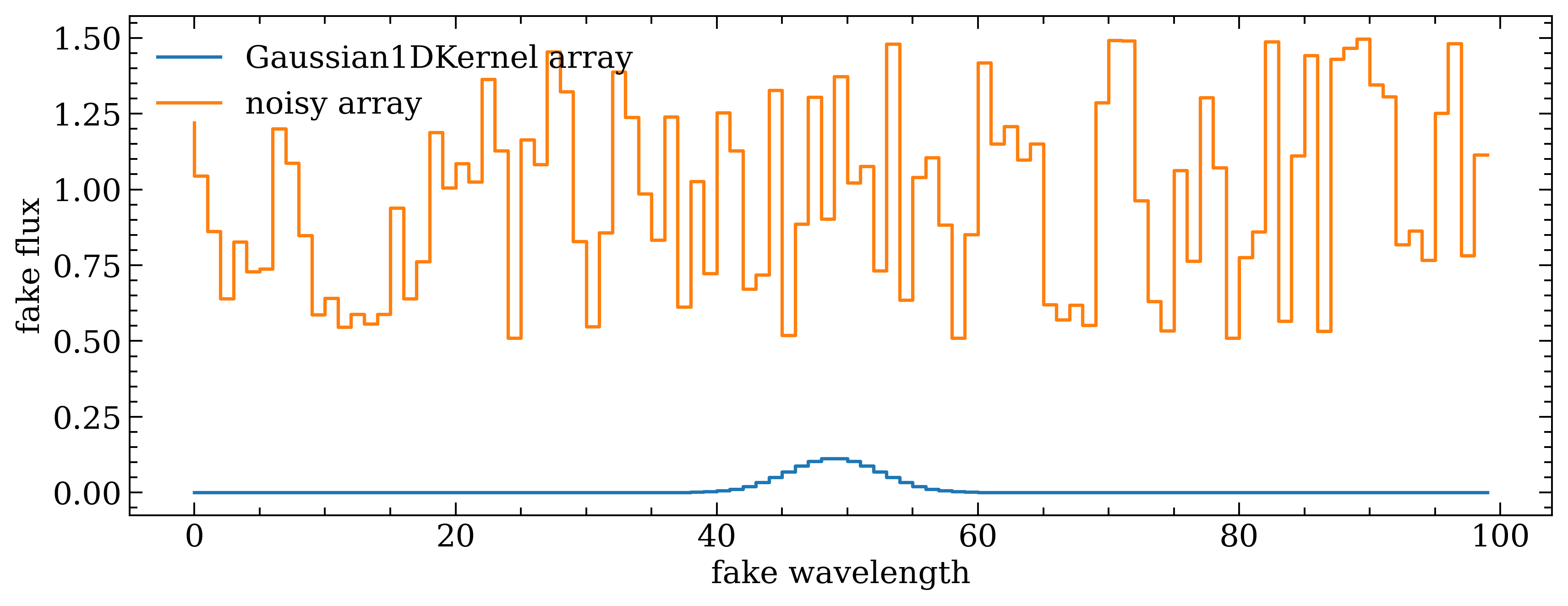
Okay, so we need to first scale up the strength of the Gaussian so it's larger than the scatter of the noise in noisy_array, then we can shift up the Gaussian array so its baseline sits at 1. THEN we add the two arrays together.
```python
# first increasing the "strength" of the Gaussian by multiplying it by 10 (randomly chosen)
stronger_gaussian = gaussian * 10
# now shifting the Gaussian array up so the baseline is at 1, not 0; by adding.
stronger_gaussian += 1
# now adding the two arrays together!
noisy_gaussian_array = noisy_array + stronger_gaussian
plt.figure(figsize=(10,4))
plt.step(range(100),stronger_gaussian,label='stronger Gaussian array')
plt.step(range(100),noisy_array,label='noisy array')
plt.step(range(100),noisy_gaussian_array,label='noisy+Gaussian array')
plt.xlabel('fake wavelength')
plt.ylabel('fake flux')
plt.legend()
plt.show()
plt.close('all')
```
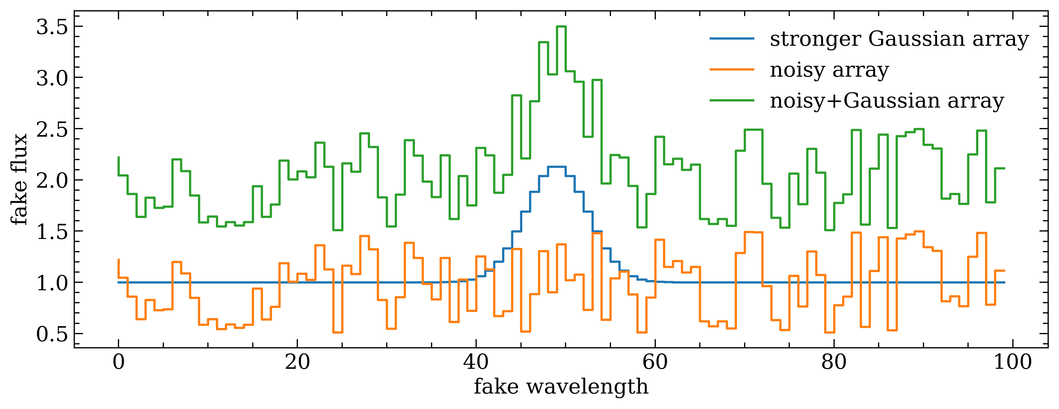
Success! The green spectrum (noisy+Gaussian array) now looks like a real spectrum from a telescope, with an emission line (the Gaussian) well-detected. With this fake spectrum, you can do a lot of things including testing your emission line fitting code, visualization code, the reliability of a line-fitting package (because you can literally control the input data, so you know what that package _should_ be fitting and if it doesn't fit it well), and more!
---------------
## Scaling Up — Making 2D Data
Now let's take the concepts we learned from making fake 1D data and scale up to 2D data, including adding a 2D emission line!
```python
# making a 2D array of 100 values
base_array = np.ones((10,10)) # shape is 10x10
print(base_array)
```
[[1. 1. 1. 1. 1. 1. 1. 1. 1. 1.]
[1. 1. 1. 1. 1. 1. 1. 1. 1. 1.]
[1. 1. 1. 1. 1. 1. 1. 1. 1. 1.]
[1. 1. 1. 1. 1. 1. 1. 1. 1. 1.]
[1. 1. 1. 1. 1. 1. 1. 1. 1. 1.]
[1. 1. 1. 1. 1. 1. 1. 1. 1. 1.]
[1. 1. 1. 1. 1. 1. 1. 1. 1. 1.]
[1. 1. 1. 1. 1. 1. 1. 1. 1. 1.]
[1. 1. 1. 1. 1. 1. 1. 1. 1. 1.]
[1. 1. 1. 1. 1. 1. 1. 1. 1. 1.]]
Now, let's again add in some randomness, using `numpy.random.rand` ([definition](https://numpy.org/doc/stable/reference/random/generated/numpy.random.rand.html)). This returns random decimal numbers between 0 and 1, matching whatever dimensions we give it.
```python
# first making the random values array, the same size as the base_array
randomness = np.random.rand(10,10) # shape is 10x10
# this time, to make a stronger noise let's multiply the randomness array by the base_array
noisy_array = base_array * randomness
```
```python
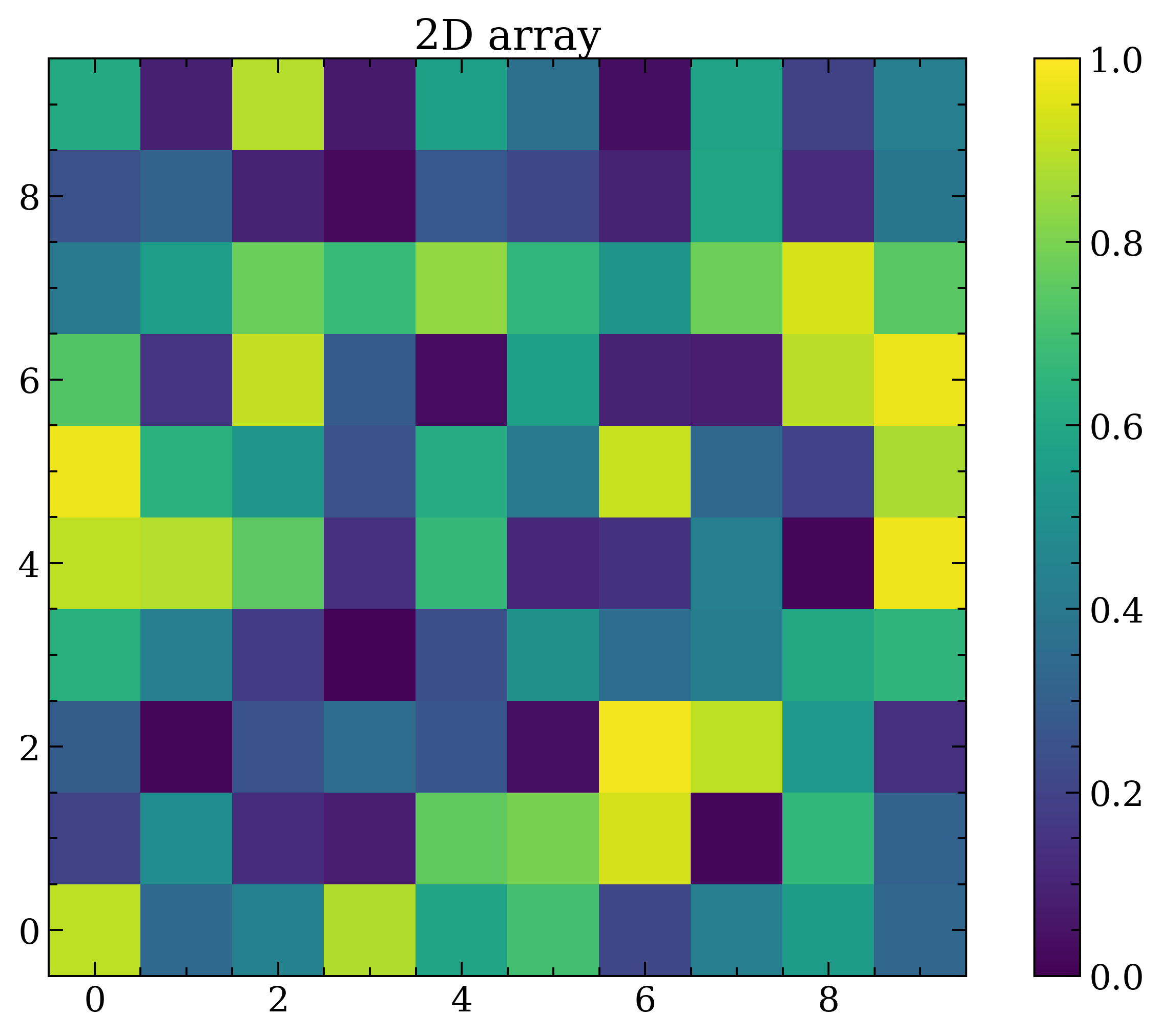
# looking at it
plt.figure()
plt.title('2D array')
im = plt.imshow(noisy_array,clim=(0,1))
plt.colorbar(im)
plt.show()
plt.close('all')
```
### Adding more "signal" to fake data
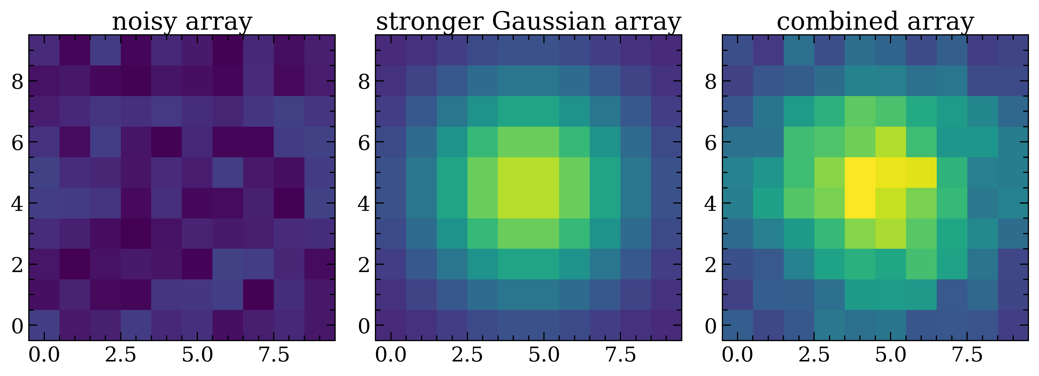
Same as with the 1D array, we'll be adding a fake emission line to the 2D data using astropy's Gaussian kernels. However, this time it'll be the 2D kernel.
```python
from astropy.convolution import Gaussian2DKernel # making fake data
# let's look at what this function entails, like we did before :)
Gaussian2DKernel?
```
```python
# PRINTED OUTPUT
'''
Init signature: Gaussian2DKernel(stddev, **kwargs)
Docstring:
2D Gaussian filter kernel.
The Gaussian filter is a filter with great smoothing properties. It is
isotropic and does not produce artifacts.
The generated kernel is normalized so that it integrates to 1.
Parameters
----------
x_stddev : float
Standard deviation of the Gaussian in x before rotating by theta.
y_stddev : float
Standard deviation of the Gaussian in y before rotating by theta.
theta : float or `~astropy.units.Quantity` ['angle']
Rotation angle. If passed as a float, it is assumed to be in radians.
The rotation angle increases counterclockwise.
x_size : int, optional
Size in x direction of the kernel array. Default = ⌊8*stddev + 1⌋.
y_size : int, optional
Size in y direction of the kernel array. Default = ⌊8*stddev + 1⌋.
mode : {'center', 'linear_interp', 'oversample', 'integrate'}, optional
One of the following discretization modes:
* 'center' (default)
Discretize model by taking the value
at the center of the bin.
* 'linear_interp'
Discretize model by performing a bilinear interpolation
between the values at the corners of the bin.
* 'oversample'
Discretize model by taking the average
on an oversampled grid.
* 'integrate'
Discretize model by integrating the
model over the bin.
factor : number, optional
Factor of oversampling. Default factor = 10.
See Also
--------
Box2DKernel, Tophat2DKernel, RickerWavelet2DKernel, Ring2DKernel,
TrapezoidDisk2DKernel, AiryDisk2DKernel, Moffat2DKernel
Examples
--------
Kernel response:
.. plot::
:include-source:
import matplotlib.pyplot as plt
from astropy.convolution import Gaussian2DKernel
gaussian_2D_kernel = Gaussian2DKernel(10)
plt.imshow(gaussian_2D_kernel, interpolation='none', origin='lower')
plt.xlabel('x [pixels]')
plt.ylabel('y [pixels]')
plt.colorbar()
plt.show()
File: ~/miniforge3/envs/stenv/lib/python3.12/site-packages/astropy/convolution/kernels.py
Type: type
Subclasses:
'''
```
```python
# using Gaussian1DKernel from astropy
gaussian2D = Gaussian2DKernel(x_stddev=2.5,y_stddev=2.5,
x_size=len(noisy_array[0]),
y_size=len(noisy_array)).array # shape is 10x10
```
```python
# we'll need to scale up the values again, so multiplying by a large just to get it visible in the plot below
stronger_gaussian2D = gaussian2D * 150
# scaling gaussian2D to match "baseline" of noisy_array (using median)
stronger_gaussian2D += np.median(noisy_array)
# LAST STEP
# added together with noisy_data
noisy_gaussisan2D_array = noisy_array + stronger_gaussian2D
```
```python
# looking at noisy data next to the emission line, then adding them both together in the final panel
plt.figure(figsize=(10,4))
gs = gridspec.GridSpec(1,3)
clims = (0,5) # to make them all scaled the same
# noisy data
ax = plt.subplot(gs[0])
ax.set_title('noisy array')
ax.imshow(noisy_array,clim=clims)
# 2D Gaussian
ax = plt.subplot(gs[1])
ax.set_title('stronger Gaussian array')
ax.imshow(stronger_gaussian2D,clim=clims)
# 2D Gaussian
ax = plt.subplot(gs[2])
ax.set_title('combined array')
ax.imshow(noisy_gaussisan2D_array,clim=clims)
plt.show()
plt.close('all')
```
.
.
.
Those are basics! Now go forth and explore!